
TIBCO Cloud Integration Benchmarking Study
Unmoderated usability benchmarking study conducted over 8 weeks

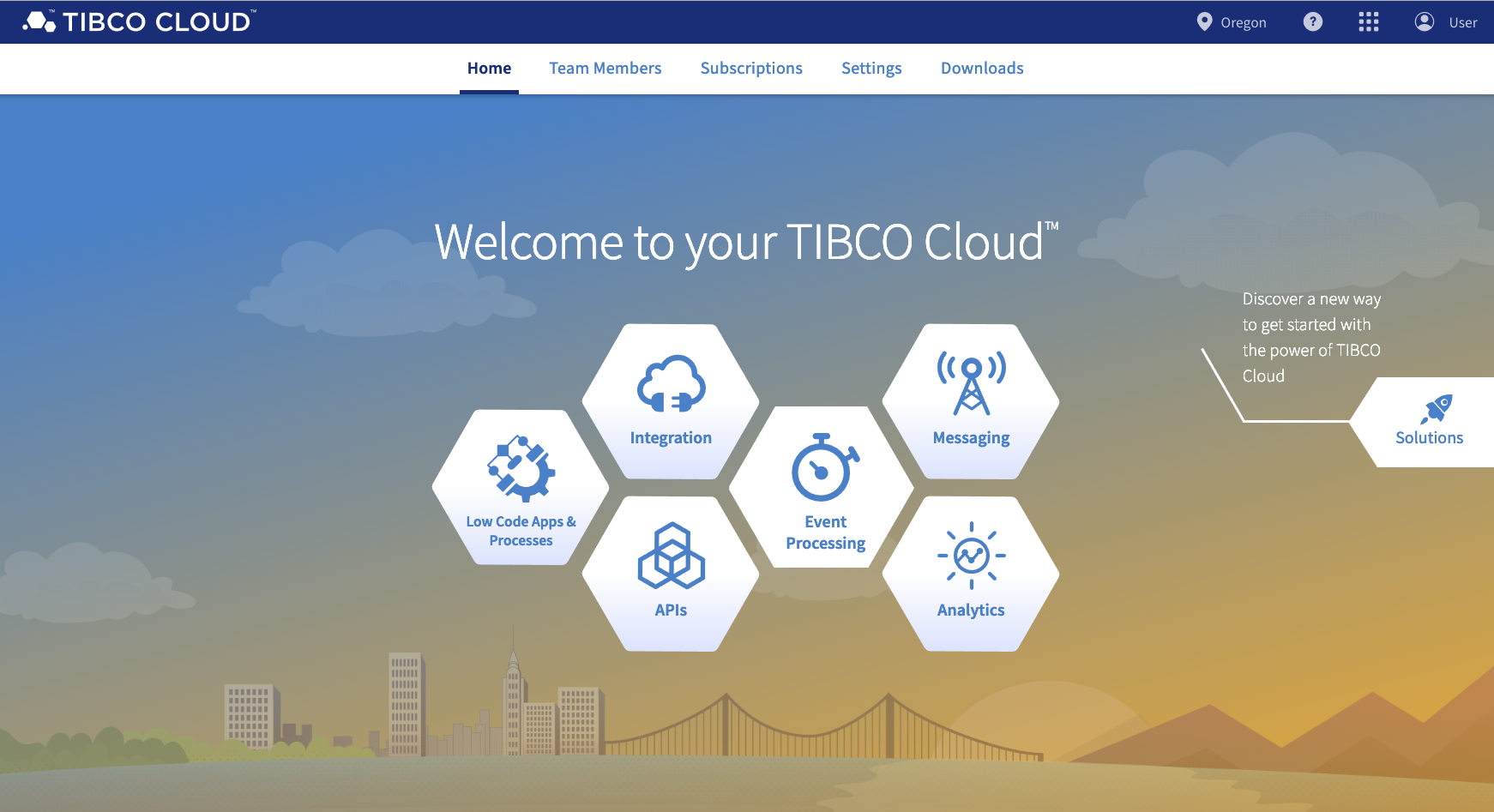
TIBCO Cloud Integration (TCI) is an enterprise product that allows users to integrate data from different sources to communicate effectively with each other. Users could easily create data connections between different software products such as SalesForce and Marketo, along with being able to choose from hundreds of pre-created connections for popular enterprise software products.
Recently, TCI had a major update to its core functionality and overall design. I felt this transition would be a good opportunity to measure the overall usability of the product as it changes. I chose to do a usability benchmarking study of both the original version and the updated version of TCI to gain better insights into how common tasks had been updated, how the usability of the product had changed, and what aspects of the product would need to be further updated in the new design.
I felt that the results from a large benchmarking study like this would benefit more than just the current design of the product. For example, if major improvements in usability could be discovered and measured, the marketing division of this product could use this information to drive sales. Another example could be utilizing the results of this study in later research studies, such as a competitive benchmarking study to compare the usability and user sentiment of competing products.
I proposed this plan to the lead interaction designer and product manager for TCI. They helped me determine the direction of the project, including a timeline and priority of user tasks. Though I ran the study autonomously, I checked in with the designer and PM every two weeks to present my progress and determine any updates to the timeline.
Though there are specific aspects of this research study that I cannot talk about openly, I will do my best to paint a clear picture of the process of planning, conducting, and reporting on this usability test study.
TCI 1.34 Study
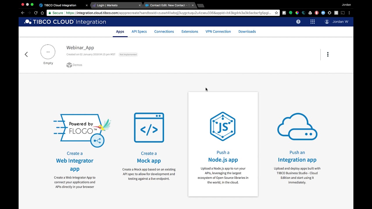
Screens from the previous build of TCI
Research Questions and Plan
I chose to use a usability benchmarking study as the main research methodology for this study. In the past, smaller scale usability studies had been done on individual aspects of the product, but I felt that a study of the overall experience using the product would be more valuable for comparing these two versions, as well as any other future changes to the overall experience. I also wanted to gather multiple metrics from a large sample size of users to try and learn as much as possible from this study and potentially identify any areas where further research may be necessary.
As mentioned previously, the study was done for both the previous (1.34) and the new (2.0) versions of TCI. To ensure that the results of these tests could be accurately compared, I did not change any of the testing or analysis protocol between the two tests. I also chose the tasks specifically to be core features that had a major design/function change between the two versions and left out features that did not change. For each version, I ran the test with 15 users, which could be considered too large for a standard usability testing study but is recommended for a benchmark study.
Some of the overall guiding research questions for this study include:
- Which specific features/user flows have improved/worsened between 1.34 and 2.0?
- How do users feel about the experience of using TCI as a whole?
- How do basic task success rates differ between 1.34 and 2.0?
- What other metrics differ drastically between 1.34 and 2.0?
- Which problems in 1.34 were addressed in 2.0? Which persist?
Protocol
In each test, there were 10 tasks that users were asked to complete, with each test taking around 30-40 minutes. Users were recruited through Usertesting.com using a strict screener to gather participants who have experience using TCI or a similar integration platform. The unmoderated test was also administered through Usertesting.com, which also recorded the tests, measured several metrics, and allowed for timestamped notetaking, which helped me gather quotes to analyze. I took special care when creating each task to make sure the tasks followed a reasonable scenario and that one task failure could be easily recovered from by moving on to the next step. I also made sure to phrase the tasks very generally, use terms and logic that makes sense to users of the program, and avoid using specific terms that were used as signifiers within the system (such as button names, nav item names, etc).
Here are a few examples of the tasks in this test:
You want to make an automation application that connects available books to your POS system. To start, make a Flogo application that uses sample data of what your database looks like. You can download this sample .json data here.
- Before starting the task, please describe how you believe you would do this based on the screen you are seeing right now.
- Now, try to make an application using the test data. When you believe you have completed the task, move on to the next task.
Your application seems to have an issue. Before diagnosing what’s going wrong, you want to stop the application from running.
- Before starting the task, please describe how you believe you would do this based on the screen you are seeing right now.
- Now, try to stop the application from running.
Your company uses MongoDB, and you want to create a link between databases hosted there and your online POS system.
- Before starting the task, please describe how you believe you would do this based on the screen you are seeing right now.
- Now, try to create the link to MongoDB.
Metrics
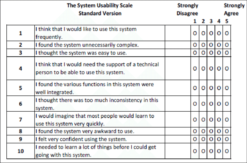
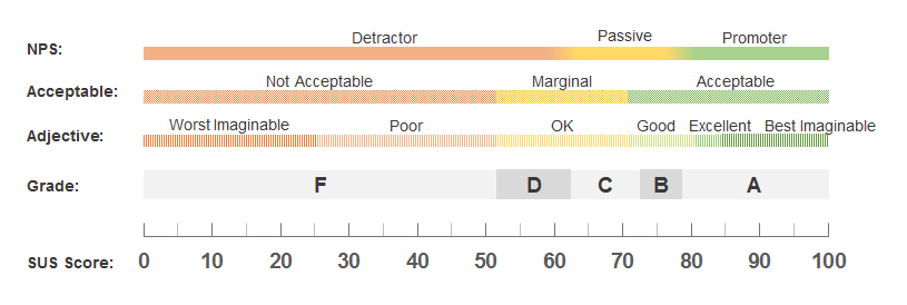
Some of the metrics tracked and measured during each task included success rate and difficulty rating. Each test was also reviewed and notes were taken to be used in a thematic analysis. At the end of each test, users were asked several questions about their experience with the product as a whole as part of a System Usability Scale (SUS) test, which is an industry-standard test that can be scored to give an overall gauge on the perceived usability of a product. Though 15 users is a large sample size by qualitative method standards, I felt that the number of participants did not warrant any advanced quantitative analysis and stuck with more simple measures, like mean, medians, etc.
Constraints
As with any research plan, I had to make certain considerations based on the resources available to me. Here are some of those considerations summarized:
- I was unable to secure users from customers of our product based on the allotted timeline. This had some benefits, such as users being new to the product and unbiased, but I would have liked to have some insights from true users of the product. These users may have had this study take a different approach, such as an interview study.
- Though Usertesting.com fills the gaps for easy recruitment/analysis, our license did not allow for moderated usability testing sessions. Though unmoderated usability sessions are our most standard method at TIBCO, I would have preferred to moderate these benchmarking sessions. The sessions captured a large amount of data even unmoderated, but I would have liked to have had the ability to follow up with participants during testing on more interesting or subtle points they made.
Analysis and Results
Once the tests were complete, I watched each video and took notes on any relevant themes that came up (these were usually specific to a task, but other overarching themes also came up). I pulled this note data, along with task success rates, task difficulty ratings, and SUS scores, from Usertesting.com and analyzed it all in Excel. After developing themes, comparing averages from task success and difficulty, and calculating an SUS score, I created several key findings. I presented these findings in the form of a research report, a one-paged topline report, and a short presentation for stakeholders.
Though I cannot go into specifics of the findings deeply, I can say that each finding was supported by several themes, user quotes, and metrics. The combination of the findings, metrics, and SUS score showed that the overall product was somewhat usable, but had opportunity for improvement.
I refrained from making design recommendations at this stage because there was already a new version about to be released. However, these findings were used as a basis of comparison and an overall checklist of items to confirm in the next round of testing.
TCI 2.0 Study - Quick Overview
To keep the tests as consistent as possible, very little of the testing protocol and analysis process was changed between the 1.34 and 2.0 benchmarks. However, after all the notetaking and analysis was done, I used the metrics and findings from the 1.34 round of testing to make several comparisons between the two systems. From these comparisons and several other findings from the 2.0 round of testing, I determined several key findings for the new TCI design and made design recommendations ranked by priority and feasibility. I presented this information through a research report for the designers and a one-paged topline report of design recommendations for stakeholders.
Though I cannot discuss these key findings and recommendations, I can say that the new design proved to be more usable overall based on the metrics, user quotes, and SUS scoring. Even so, there were still opportunities to streamline the overall process and avoid issues. The recommendations I put forward will go far to help perfect the overall experience of using TCI.
Next Steps
I completed this project right before I departed TIBCO, but that does not mean this project was completely put to bed yet. The first step which I would have done myself was to make JIRA tickets and ensure that the design recommendations are implemented before the first major update.
Along with design recommendations, I made recommendations for future research projects based on these findings. Without getting too technical, one of the main recommendations made was to focus a future research effort on understanding some of the core product features that did not change between versions. These features were not tested in this project but seemed the next big issue to tackle in terms of understanding how our users interact with the product as a whole.
Conclusion
In the end, I was very pleased with the results of this study. I have done many usability studies before, but this was my first attempt at a usability benchmarking study and I believe it went well. As with any project, there are some aspects that I wish I could have done differently or followed up on, but overall the project went smoothly and the results were concrete and valuable. Though this was my last research project with TIBCO, I believe it was a good note to end on and I am excited to use this methodology on other projects in the future.
Mario Paolini 2023
Built on WordPress and self-hosted on a Raspberry Pi